How I Teach Gerrymandering, v2
I wrote last year about how I’ve taught gerrymandering to students at Splash, and why. It’s been a year, I’ve made a number of updates to the class, and gerrymandering is back in the news, so it seems time for some updates. Below, find the changes I’ve made, editable versions of the maps to use yourself, and what’s next. Most of this will make more sense if you’ve read my previous post.
Changes I’ve made
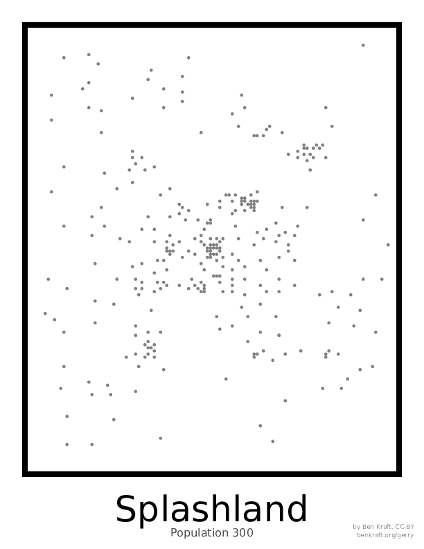
As you’ll see below, the most obvious change I’ve made is to use smaller maps. It’s a little harder to fit exactly the phenomena I want into them, but it means students spend a lot less time counting up districts and hopefully some more time thinking about the underlying ideas. Using the same map (even with the same dots on it) for all the variations also removes another little bit of cognitive overhead – it’s always the same 30 precincts, 6 districts, and same geographic pattern, like so:
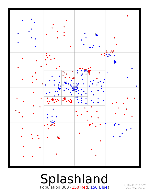
In the time I save from the smaller maps, I’ve added a map where the students try to draw the fairest maps they can. (It’s actually the same as the first map where they’re drawing a biased map.) This has had interesting results – usually some people go for all competitive districts, while others don’t pay as much attention to that and think about other factors.
When we discuss real maps at the end, I’ve made a stronger attempt to tie them directly to themes we’ve discussed, and pick maps that are apropos or that I can talk a bit more about. So I point to majority-minority districts in North Carolina, districts in Florida that figured in court battles there, and of course Arizona and its independent commission. Since I see this as one of the most important parts of the class there’s still a lot more I want to do here.
Maps to use
I’ve received several requests from friends to use the maps themselves, so I figured I’d put them up on GitHub. They’ll make the most sense if you’ve seen me teach the class, but I’ve also included my own notes from teaching as a reference, and some pointers in the README. You can download the entire set here or see the source on GitHub.
What’s next
This class is still a work in progress, of course. I’d like to figure out how to get students to think a bit more about the meaning of representation in the first two maps, and try to seed more discussion there, rather than just having them draw some districts and sometimes not have too much to say about them other than “well I put the city together”. I’d like to continue to better tie in real maps to the themes in the class. And I’m considering extending the class, so we can actually spend time on factors like race and incumbency, and talk more at the end about real-world implications and possible reforms and add some more discussion digging into metrics like seats/votes curves and compactness.
I’d also like to build a web version of the maps. I’m hoping that technology could save even more of the time we spend counting, while allowing students to look at a lot more fun metrics, computed automatically. And of course, then I might be able to share a bit more of the class with people who aren’t Splash students! Stay tuned.